Representation in Brain Imaging Research
A Quebec demographic overview
import plotly
import pandas as pd
import plotly.graph_objects as go
import plotly.express as px
import json
import numpy as np
import matplotlib.pyplot as plt
import seaborn as sns
import os
import matplotlib.patches as mpatches
import matplotlib.colors as mplc
import re
import plotly.colors
from plotly.offline import plot
from plotly.subplots import make_subplots
import plotly.io as pio
pio.renderers.default = "plotly_mimetype"
screening_info = ['Records obtained from Embase',
'Records obtained from MEDLINE',
'Records obtained from Google Scholar',
'Records selected for screening',
'Duplicate references removed',
"""
Title and abstract screened for relevance:<br>
- Studies not concerning brain imaging<br>
- Studies not concerning human populations<br>
- Studies not concerning MRI or PET<br>
- Studies not concerning Quebec population
""",
'Studies retrieved for evaluation',
"""
Exclusion criteria:<br>
- Review articles (n=31);<br>
- Ambiguous CT or MRI patient counts (n=14);<br>
- Case Reports (n=99);<br>
- Animal studies (n=14);<br>
- Correspondence (n=1);<br>
- Public dataset (n=84);<br>
- Conference paper (n=16);<br>
- Multisite dataset with unknown participant counts (n=776);<br>
- Post-mortem brain (n=14);<br>
- Registered report (n=2);<br>
- Wrong study design (n=8);<br>
- Unspecified location (n=37);<br>
- Study population outside Quebec (n=2052);<br>
- Duplicate dataset (n=104);
""",
'Studies selected for analysis']
fig1 = go.Figure(data=[go.Sankey(
arrangement = "freeform",
node = dict(
pad = 80,
thickness = 10,
line = dict(color = "black", width = 0.5),
label = ["References obtained from Embase",#0
"References obtained from MEDLINE",#1
"References obtained from Google Scholar",#2
"Main references identified",#3
"Studies screened",#4
"References removed",#5
"Studies excluded from retrieval", #6
"Studies assessed for eligibility",#7
"Studies exluded from review",#8
"Studies included in review"],#9
x = [0, 0, 0, 0.3, 0.5, 0.5, 0.7, 0.7, 0.9, 0.9],
y = [2, 0, 0, 0.5, 0.3, 0.9, 0.8, 0.4, 0.6, 0.2],
hovertemplate = "%{label}<extra>%{value}</extra>",
color = ["darkblue","darkblue","darkblue","darkblue","darkgreen","darkred","darkred","darkgreen","darkred","darkgreen"]
),
link = dict(
source = [0, 1, 2, 3, 3, 4, 4, 7, 7],
target = [3, 3, 3, 4, 5, 6, 7, 8, 9],
value = [6429, 3816, 100, 7279, 3068, 2476, 4801, 3252, 1549],
customdata = screening_info,
hovertemplate = "%{customdata}",
))])
fig1.update_layout(width=750,
height=500,
font_size=11,
margin=dict(l=0))
fig1.show()Loading...
data_path = os.path.join('..', 'data','qc-imaging-demographics')

fname_data = os.path.join(data_path, f"fcdata.xlsx")
df = pd.read_excel(fname_data)
fname2 = os.path.join(data_path, f"Cleaned Full data.xlsx")
df_full = pd.read_excel(fname2, sheet_name='Full that matches the formatted')

# merge superfluous ethnicity columns
df['Black'] = df.loc[:,['Black','African-American']].sum(axis=1)
df['White'] = df.loc[:,['Caucasian','Caucasian-Hispanic']].sum(axis=1)
df['Asian'] = df.loc[:,['Asian','Asian American']].sum(axis=1)
df = df.drop(columns=['African-American','Caucasian','Caucasian-Hispanic','Asian American'])
df.fillna({'Other': 0, 'Not specified' : 0, 'Middle Eastern' : 0, 'Caribbean' : 0, 'Jewish' : 0}, inplace=True)

###############
# create total participant column on the rule that if PET=MRI then all participants were scanned in both, and if not then total = PET+MRI
df['Total participants'] = df.loc[:,['PET participants','MRI participants']].sum(axis=1)
df.loc[df['PET participants']==df['MRI participants'], 'Total participants'] = df['MRI participants']

# hard coding execptions to the above rule
df.loc[118, 'Total participants'] = 25
df.loc[268, 'Total participants'] = 61
df.loc[356, 'Total participants'] = 15
df.loc[477, 'Total participants'] = 29
df.loc[572, 'Total participants'] = 24
df.loc[626, 'Total participants'] = 20
df.loc[832, 'Total participants'] = 60
df.loc[840, 'Total participants'] = 21
df.loc[1113, 'Total participants'] = 34
df.loc[1128, 'Total participants'] = 35
df.loc[1143, 'Total participants'] = 14
df.loc[1178, 'Total participants'] = 9
df.loc[1215, 'Total participants'] = 40
df.loc[1293, 'Total participants'] = 262
df.loc[1325, 'Total participants'] = 31
df.loc[1369, 'Total participants'] = 44
df.loc[1446, 'Total participants'] = 54
df.loc[1488, 'Total participants'] = 39
###############

df_full['MRI participants'] = pd.to_numeric(df_full['MRI participants'], errors='coerce').fillna(0)
df_full['PET participants'] = pd.to_numeric(df_full['PET participants'], errors='coerce').fillna(0)
df_full['Male'] = pd.to_numeric(df_full['Male'], errors='coerce').fillna(0)
df_full['Female'] = pd.to_numeric(df_full['Female'], errors='coerce').fillna(0)
df_full['Total participants'] = df_full.loc[:,['PET participants','MRI participants']].sum(axis=1)
df_full.loc[df_full['PET participants']==df_full['MRI participants'], 'Total participants'] = df_full['MRI participants']
df_full.loc[17, 'Total participants'] = 25
df_full.loc[1077, 'Total participants'] = 61
df_full.loc[833, 'Total participants'] = 15
df_full.loc[870, 'Total participants'] = 29
df_full.loc[667, 'Total participants'] = 24
df_full.loc[498, 'Total participants'] = 20
df_full.loc[757, 'Total participants'] = 60
df_full.loc[342, 'Total participants'] = 21
df_full.loc[1548, 'Total participants'] = 34
df_full.loc[41, 'Total participants'] = 35
df_full.loc[1128, 'Total participants'] = 14
df_full.loc[517, 'Total participants'] = 9
df_full.loc[987, 'Total participants'] = 40
df_full.loc[1499, 'Total participants'] = 262
df_full.loc[82, 'Total participants'] = 31
df_full.loc[1061, 'Total participants'] = 44
df_full.loc[591, 'Total participants'] = 54
df_full.loc[42, 'Total participants'] = 39


# Create unreported column based on total participants
df['Unreported Ethnicity'] = df.loc[:,'Total participants'] - df.loc[:,['Black','Asian','Other','Not specified','Middle Eastern','Caribbean','Jewish','White']].sum(axis=1)
i = list(df.columns)
a, b = i.index('Unreported Ethnicity'), i.index('Total participants')
i[b], i[a] = i[a], i[b]
df = df[i]
# Categorize pathologies
df_paths = df_full.copy()
# categorizing patient populations
pathology = {"Epilepsy" : "epilepsy|epileptic",
"Parkinson's" : "Parkinson",
"Alzheimer's" : "Alzheimer",
"Mental and behavioral disorders" : "Schizophrenia|depression|depressive|anxiety|psychosis|addiction|autism|alcohol|amusia|serotonin|emotion|PTSD|suicide|suicidal|substance|Attention|bipolar|OCD|personality",
"Multiple Sclerosis" : "Multiple Sclerosis",
"Cerebrovascular disease" : "Carotid|Stenosis|Stroke|vascualar",
"Cancer and tumors" : "tumor|cancer|adenoma|glioblastoma|angioma|neurofibromatosis|glioma|lymphoma|meningioma|schwannoma|hamartoma|sarcoma|leukemia",
"Newborns and infants" : "Neonatal|infant|newborn|child",
"Concussion and Injury" : "Injury|Concussion",
"Vision disorders" : "yopia|blind|hemianopia",
"Pain" : "pain",
"Healthy population" : "Not specified|Healthy|aging|volunteer"}
# make categorized pathology columns based on disease characteristics keywords
for p, keywords in pathology.items():
df_paths[p] = df_paths['Disease Characteristics'].str.contains(keywords, flags=re.IGNORECASE, regex=True)
df_paths['number of pathologies'] = df_paths[df_paths.columns[23:35]].sum(axis=1)
df_paths['Pathology'] = ""
# run through individual pathology columns and set the pathology for each true value
for n in df_paths.columns[23:35]:
df_paths.loc[df_paths[n]==True,'Pathology'] = n
# categorize anything with multiple pathologies or anything lying outside the scope of our keywords
for i in df_paths.index:
if df_paths.loc[i,'number of pathologies'] == 0:
df_paths.loc[i,'Pathology'] = "Other"
elif df_paths.loc[i,'number of pathologies'] > 1:
df_paths.loc[i,'Pathology'] = "Multiple categories"
# fix blank participant counts
df_paths['MRI participants'] = pd.to_numeric(df_paths['MRI participants'], errors='coerce')
df_paths['PET participants'] = pd.to_numeric(df_paths['PET participants'], errors='coerce')
# drop studies with ambiguous mri/pet participant counts (no values listed) (2 such studies)
i = df_paths.loc[df_paths['MRI participants'].isna() & df_paths['PET participants'].isna()].index
df_paths = df_paths.drop(i)
# catgeorize mri/pet/both
df_paths['MRI or PET'] = ""
for i in df_paths.index:
if (df_paths['MRI participants'][i]==0):
df_paths.loc[i,'MRI or PET'] = 'PET'
elif (df_paths['PET participants'][i]==0):
df_paths.loc[i,'MRI or PET'] = 'MRI'
else:
df_paths.loc[i,'MRI or PET'] = 'MRI and PET'
# handle studies with multiple geographical locations
idx = df_paths['Geographical location'].str.contains(',')
df_paths.loc[idx,'Geographical location'] = 'Multiple regions'year_str = df_paths['Year of Publication'].astype(str)
df_paths['Geographical location'] = df_paths['Geographical location'].replace("Montreal\n",'Montreal')
# list study info line as (first author et al., year)
df_paths['Study info'] = df_paths['Authors'].str.split(',').str[0].str.split().str[-1] + ' et al., ' + year_str
# construct hyperlink for each paper's unique DOI
df_paths['Link'] = df_paths['DOI']
df_paths['Link'] = df_paths['Link'].replace('http',"""<a style='color:white' href='http""", regex=True)
df_paths['Link'] = df_paths['Link'] + """'>->Go to the paper</a>"""
# make text box for each entry with the link and title
df_paths['Summary'] = df_paths['Link'] + '<br><br>Title: ' + df_paths['Title'].astype(str)
df_paths['N'] = np.ones((len(df_paths),1))
# handle duplicates of study info (multiple studies with same year and first author last name)
for i in range(6):
dupes = df_paths['Study info'].duplicated()
df_paths.loc[dupes,'Study info'] = df_paths.loc[dupes,'Study info'] + ' '
df_paths = df_paths.sort_values('Study info')
# construct dataframe for the treemap from the list of studies
args = dict(data_frame=df_paths, values='N',
color='N', hover_data='Study info',
path=['MRI or PET', 'Geographical location', 'Pathology', 'Study info'])
args = px._core.build_dataframe(args, go.Treemap)
treemap_df = px._core.process_dataframe_hierarchy(args)['data_frame']
fig2 = go.Figure(go.Treemap(
ids=list(treemap_df['id']),
labels=list(treemap_df['labels']),
parents=list(treemap_df['parent']),
values=list(treemap_df['N']),
branchvalues='remainder',
text=df_paths['Summary'],
hoverinfo='label', # Set to None if sorting by DOI
# customdata = treemap_df['Study info'], # use if sorting by DOI
# hovertemplate = "<b>%{customdata}</b><extra></extra>", # to be used if sorting by DOI
textfont=dict(
size=15,
)
))
fig2 = fig2.update_layout(
autosize=False,
width=750,
height=550,
margin=dict(
l=0,
r=0,
t=0,
b=45,
)
)
fig2.show()Loading...
# Categorize geographically by number of studies
# Drop studies with multiple locations, plot number of studies by city
filtered = df[~df['Geographical location'].str.contains(',')]
# removed 10 studies with multiple locations listed
#counting studies by region
# all
s1 = filtered['Geographical location'].value_counts()
# PET only
s2 = filtered[filtered['PET participants'].notna() & filtered['MRI participants'].isna()]['Geographical location'].value_counts()
# MRI only
s3 = filtered[filtered['PET participants'].isna() & filtered['MRI participants'].notna()]['Geographical location'].value_counts()
# PET+MRI studies
s4 = filtered[filtered['PET participants'].notna() & filtered['MRI participants'].notna()]['Geographical location'].value_counts()
# all
regs_all = pd.DataFrame({'Region' : s1.index, 'count' : s1.values})
regs_all['Region'] = ['Montreal', 'Estrie', 'Capitale-Nationale', 'Mauricie', 'Saguenay - Lac-Saint-Jean', 'Monteregie']
regs_all.loc[len(regs_all.index)]=['Gaspesie - Iles-de-la-Madeleine', 0]
regs_all.loc[len(regs_all.index)]=['Abitibi-Temiscamingue', 0]
regs_all.loc[len(regs_all.index)]=['Outaouais', 0]
regs_all.loc[len(regs_all.index)]=['Nord-du-Quebec', 0]
regs_all.loc[len(regs_all.index)]=['Laurentides', 0]
regs_all.loc[len(regs_all.index)]=['Lanaudiere', 0]
regs_all.loc[len(regs_all.index)]=['Chaudiere-Appalaches', 0]
regs_all.loc[len(regs_all.index)]=['Cote-Nord', 0]
regs_all.loc[len(regs_all.index)]=['Bas-Saint-Laurent', 0]
regs_all.loc[len(regs_all.index)]=['Centre-du-Quebec', 0]
regs_all.loc[len(regs_all.index)]=['Laval', 0]
# PET only
regs_pet = pd.DataFrame({'Region' : s2.index, 'count' : s2.values})
regs_pet['Region'] = ['Montreal', 'Capitale-Nationale', 'Estrie']
regs_pet.loc[len(regs_pet.index)]=['Mauricie', 0]
regs_pet.loc[len(regs_pet.index)]=['Saguenay - Lac-Saint-Jean', 0]
regs_pet.loc[len(regs_pet.index)]=['Monteregie', 0]
regs_pet.loc[len(regs_pet.index)]=['Gaspesie - Iles-de-la-Madeleine', 0]
regs_pet.loc[len(regs_pet.index)]=['Abitibi-Temiscamingue', 0]
regs_pet.loc[len(regs_pet.index)]=['Outaouais', 0]
regs_pet.loc[len(regs_pet.index)]=['Nord-du-Quebec', 0]
regs_pet.loc[len(regs_pet.index)]=['Laurentides', 0]
regs_pet.loc[len(regs_pet.index)]=['Lanaudiere', 0]
regs_pet.loc[len(regs_pet.index)]=['Chaudiere-Appalaches', 0]
regs_pet.loc[len(regs_pet.index)]=['Cote-Nord', 0]
regs_pet.loc[len(regs_pet.index)]=['Bas-Saint-Laurent', 0]
regs_pet.loc[len(regs_pet.index)]=['Centre-du-Quebec', 0]
regs_pet.loc[len(regs_pet.index)]=['Laval', 0]
# MRI only
regs_mri = pd.DataFrame({'Region' : s3.index, 'count' : s3.values})
regs_mri['Region'] = ['Montreal', 'Estrie', 'Capitale-Nationale', 'Mauricie', 'Saguenay - Lac-Saint-Jean', 'Monteregie']
regs_mri.loc[len(regs_mri.index)]=['Gaspesie - Iles-de-la-Madeleine', 0]
regs_mri.loc[len(regs_mri.index)]=['Abitibi-Temiscamingue', 0]
regs_mri.loc[len(regs_mri.index)]=['Outaouais', 0]
regs_mri.loc[len(regs_mri.index)]=['Nord-du-Quebec', 0]
regs_mri.loc[len(regs_mri.index)]=['Laurentides', 0]
regs_mri.loc[len(regs_mri.index)]=['Lanaudiere', 0]
regs_mri.loc[len(regs_mri.index)]=['Chaudiere-Appalaches', 0]
regs_mri.loc[len(regs_mri.index)]=['Cote-Nord', 0]
regs_mri.loc[len(regs_mri.index)]=['Bas-Saint-Laurent', 0]
regs_mri.loc[len(regs_mri.index)]=['Centre-du-Quebec', 0]
regs_mri.loc[len(regs_mri.index)]=['Laval', 0]
# Studies with MRI and PET imaging
regs_both = pd.DataFrame({'Region' : s4.index, 'count' : s4.values})
regs_both['Region'] = ['Montreal', 'Estrie', 'Capitale-Nationale']
regs_both.loc[len(regs_both.index)]=['Mauricie', 0]
regs_both.loc[len(regs_both.index)]=['Saguenay - Lac-Saint-Jean', 0]
regs_both.loc[len(regs_both.index)]=['Monteregie', 0]
regs_both.loc[len(regs_both.index)]=['Gaspesie - Iles-de-la-Madeleine', 0]
regs_both.loc[len(regs_both.index)]=['Abitibi-Temiscamingue', 0]
regs_both.loc[len(regs_both.index)]=['Outaouais', 0]
regs_both.loc[len(regs_both.index)]=['Nord-du-Quebec', 0]
regs_both.loc[len(regs_both.index)]=['Laurentides', 0]
regs_both.loc[len(regs_both.index)]=['Lanaudiere', 0]
regs_both.loc[len(regs_both.index)]=['Chaudiere-Appalaches', 0]
regs_both.loc[len(regs_both.index)]=['Cote-Nord', 0]
regs_both.loc[len(regs_both.index)]=['Bas-Saint-Laurent', 0]
regs_both.loc[len(regs_both.index)]=['Centre-du-Quebec', 0]
regs_both.loc[len(regs_both.index)]=['Laval', 0]# Load in quebec administrative region geographic data
# region labels with accents removed so they could be read
geoname_data = os.path.join(data_path, f"quebec.geojson")
with open(geoname_data) as f:
var_geojson = json.load(f)colorscale = [[0.0, "#FFFFC0"], [0.5, "#CBC7C0"], [1.0, "#FFFFF0"]]
# filled grey map of administrative regions
trace1 = go.Choropleth(geojson=var_geojson,
showscale=False,
colorscale=colorscale,
zmin=0, zmax=1,
z=[0.5]*len(var_geojson['features']),
locations=regs_all['Region'],
featureidkey='properties.name',
hoverinfo='skip')
# sized markers for number of studies by region
maxval=regs_all['count'].max()
minval=regs_all['count'].min()
trace2 = go.Scattergeo(mode='markers',
marker=dict(size=np.power(regs_all['count'],0.5)*10, sizemode='area',
opacity=0.8,
cmin=minval,
cmax=maxval,
color=regs_all['count'],
colorbar_title='Number of studies'),
geojson=var_geojson,
locations=regs_all['Region'],
featureidkey='properties.name',
customdata=regs_all[['Region','count']],
hovertemplate=
"<b>%{customdata[0]}</b><br>" +
"<b>Studies:</b> %{customdata[1]}<extra></extra>")
maxval=regs_pet['count'].max()
minval=regs_pet['count'].min()
trace3 = go.Scattergeo(mode='markers',
marker=dict(size=np.power(regs_pet['count'],0.5)*30, sizemode='area',
opacity=0.8,
cmin=minval,
cmax=maxval,
color=regs_pet['count'],
colorbar_title='Number of studies'),
geojson=var_geojson,
locations=regs_pet['Region'],
featureidkey='properties.name',
customdata=regs_pet[['Region','count']],
visible=False,
hovertemplate=
"<b>%{customdata[0]}</b><br>" +
"<b>Studies:</b> %{customdata[1]}<extra></extra>")
maxval=regs_mri['count'].max()
minval=regs_mri['count'].min()
trace4 = go.Scattergeo(mode='markers',
marker=dict(size=np.power(regs_mri['count'],0.5)*10, sizemode='area',
opacity=0.8,
cmin=minval,
cmax=maxval,
color=regs_mri['count'],
colorbar_title='Number of studies'),
geojson=var_geojson,
locations=regs_mri['Region'],
featureidkey='properties.name',
customdata=regs_mri[['Region','count']],
visible=False,
hovertemplate=
"<b>%{customdata[0]}</b><br>" +
"<b>Studies:</b> %{customdata[1]}<extra></extra>")
maxval=regs_both['count'].max()
minval=regs_both['count'].min()
trace5 = go.Scattergeo(mode='markers',
marker=dict(size=np.power(regs_both['count'],0.5)*15, sizemode='area',
opacity=0.8,
cmin=minval,
cmax=maxval,
color=regs_both['count'],
colorbar_title='Number of studies'),
geojson=var_geojson,
locations=regs_both['Region'],
featureidkey='properties.name',
customdata=regs_both[['Region','count']],
visible=False,
hovertemplate=
"<b>%{customdata[0]}</b><br>" +
"<b>Studies:</b> %{customdata[1]}<extra></extra>")
# remove all default layout elements, only interested in quebec
layout = go.Layout(
geo=dict(showland=False,
showcountries=False,
showocean=False,
showrivers=False,
showlakes=False,
showcoastlines=False)
)
fig = go.Figure(data = [trace1, trace2, trace3, trace4, trace5], layout=layout)
#conic conformal projection recommended by Statistics Canada https://www150.statcan.gc.ca/n1/pub/92-195-x/2011001/other-autre/mapproj-projcarte/m-c-eng.htm
fig.update_geos(fitbounds="locations", projection_type='conic conformal')
fig.update_layout(
updatemenus=[
dict(
buttons=list([
dict(label="All studies",
method="update",
args=[{"visible": [True, True, False, False, False]}]),
dict(label="PET studies",
method="update",
args=[{"visible": [True, False, True, False, False]}]),
dict(label="MRI studies",
method="update",
args=[{"visible": [True, False, False, True, False]}]),
dict(label="PET+MRI studies",
method="update",
args=[{"visible": [True, False, False, False, True]}]),
]),
)
]
)
fig.update_layout(width=750, height=600)
fig.show()Loading...
df = df.rename(columns = dict({'Average Age (Years)' : 'Age'}))

# studies with no age reported.
noagedf = df[df['Age'].isna()]

# drop all nans, empties, nonnumerics (entries with > or other symbols)
Agedf = df.copy()
Agedf['Age'] = pd.to_numeric(Agedf['Age'], errors='coerce')
Agedf = Agedf.dropna(subset=['Age'])


bins = np.arange(0,90,5)

agebincounts = []
agecounts = []
labels = []
for i,x in enumerate(bins):
    agebincounts.append( len(Agedf[(Agedf['Age'] >= x) & (Agedf['Age'] < (x+5))].index) )
    agecounts.append(Agedf.loc[(Agedf['Age'] >= x) & (Agedf['Age'] < (x+5)), 'Total participants'].sum())
    labels.append( f'{x}-{x+5}' )

unreported_studies = len(noagedf.index)
unreported_participants = noagedf['Total participants'].sum()

ages1 = pd.DataFrame({'Range':labels, 'count':agebincounts})
ages2 = pd.DataFrame({'Range':labels, 'count':agecounts})

ages1.loc[len(ages1.index)] = ['Unreported', unreported_studies]
ages2.loc[len(ages2.index)] = ['Unreported', unreported_participants]

colors = ["royalblue"]*18 + ["dimgrey"]

bar1 = go.Bar(
    x = ages1['Range'],
    y = ages1['count'],
    marker_color=colors,
    customdata=ages1['count']/ages1['count'].sum()*100,
    hovertemplate="Percent of studies: %{customdata:.3f}%<extra></extra>",
    yaxis='y'
)

bar2 = go.Bar(
    x=ages2['Range'],
    y=ages2['count'],
    marker_color=colors,
    customdata=ages2['count']/ages2['count'].sum()*100,
    hovertemplate="Percent of participants: %{customdata:.3f}%<extra></extra>",
    visible=False,
    yaxis='y'
)

bar1p = go.Bar(
    x = ages1['Range'],
    y = ages1['count']/ages1['count'].sum()*100,
    marker_color=colors,
    hovertemplate="Percent of studies: %{value:.3f}%<extra></extra>",
    yaxis='y2',
    visible=True
)

bar2p = go.Bar(
    x = ages2['Range'],
    y = ages2['count']/ages2['count'].sum()*100,
    marker_color=colors,
    hovertemplate="Percent of participants: %{value:.3f}%<extra></extra>",
    yaxis='y2',
    visible=False
)

fig=go.Figure(data=[bar1,bar2,bar1p,bar2p],
             layout={
                 'yaxis' : {'title':'Number of studies', 'showgrid':False},
                 'yaxis2' : {'title': 'Percent of studies', 'overlaying': 'y', 'side': 'right'}
             })

fig.update_layout(xaxis_tickangle=-45,
                 barmode='group', width=750, height=550, showlegend=False, plot_bgcolor='rgba(0.2, 0.2, 0.2, 0.2)',
                 xaxis=dict(title="Average age"),
                 margin=dict(t=140, b=0, l=0, r=0))

fig.update_layout(
    updatemenus=[
        dict(
            buttons=list([
                dict(label="By number of studies",
                     method="update",
                     args=[{"visible": [True, False, True, False]},
                           {'yaxis' : {'title':'Number of studies', 'showgrid':False},
                            'yaxis2' : {'title': 'Percent of studies', 'overlaying': 'y', 'side': 'right'}}]),
                dict(label="By number of participants",
                     method="update",
                     args=[{"visible": [False, True, False, True]},
                           {'yaxis' : {'title':'Number of participants', 'showgrid':False},
                            'yaxis2' : {'title': 'Percent of participants', 'overlaying': 'y', 'side': 'right'}}])
            ]),
            xanchor='left',
            y=1.12,
            pad={"l": 50, "t": 0}
        )]
    )
Loading...
# Sex analysis
# male and female totals reported in most studies
male = df_full['Male'].sum()
female = df_full['Female'].sum()
# majority of unreported sex is studies which report no sex at all, however some is from studies which only partially report sex
unreported = (df_full.loc[:,'Total participants'] - df_full.loc[:,['Male','Female']].sum(axis=1)).sum()

plt.style.use('ggplot')
sns.set_palette("colorblind")
labels = ['Male', 'Female', 'Unreported']
sizes = [male, female, unreported]
fig, ax = plt.subplots()
ax.pie(sizes, labels=labels,autopct='%1.1f%%',explode=[0,0,.15])
plt.show()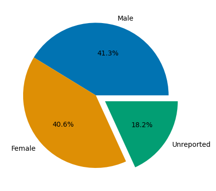
# drop all rows with no age information, and eliminate nonnumerics (e.g. entries where age is listed as >0.69)
Agedf2 = df[df['Age'].notna()].copy()
Agedf2['Age'] = pd.to_numeric(Agedf2['Age'], errors='coerce')
Agedf2 = Agedf2.dropna(subset=['Age'])

# drop rows with no male or female information
Agedf2 = Agedf2[~((Agedf2['Female'].isna()) & Agedf2['Male'].isna())]
# Here we are down to 1085 studies from 1553

bins = np.arange(0,90,5)
agecounts_male = []
agecounts_female = []
labels = []
for i,x in enumerate(bins):
    agecounts_male.append( Agedf2.loc[(Agedf2['Age'] >= x) & (Agedf2['Age'] < (x+5)), 'Male'].sum() )
    agecounts_female.append( Agedf2.loc[(Agedf2['Age'] >= x) & (Agedf2['Age'] < (x+5)), 'Female'].sum() )
    labels.append( f'{x}-{x+5}' )


labels.reverse()
agecounts_male.reverse()
agecounts_female.reverse()
pyramid_df = pd.DataFrame(data={'age range':labels, 'male':agecounts_male, 'female':agecounts_female})
pyramid_df['male'] = pyramid_df['male'] * -1

ax1 = sns.barplot(x='male', y='age range', data=pyramid_df, palette="Reds", hue=labels)
ax2 = sns.barplot(x='female', y='age range', data=pyramid_df, palette="Blues", hue=labels)
plt.xlabel("             Male    Female")
plt.xticks(ticks=[-4000, -2000, 0, 2000, 4000], labels=[4000, 2000, 0, 2000, 4000])

plt.show()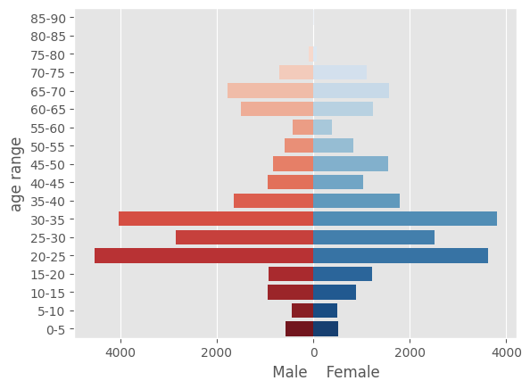
# relational age/sex plot with percentages
# make percentage column
df['Male'] = df['Male'].fillna(0)
df['Female'] = df['Female'].fillna(0)
ser = df['Female'] / df.loc[:,['Female','Male']].sum(axis=1) *100
try:
    df.insert(7, "Percentage female", ser)
except ValueError:
    pass

# Joint distribution of average age of participants and sex as a percentage of participants
df_rel = df[~(df['Percentage female'].isnull())].copy()
df_rel['Age'] = pd.to_numeric(df_rel['Age'], errors='coerce')
df_rel = df_rel.dropna(subset=['Age'])

norm = mplc.LogNorm(vmin=10, vmax=300, clip=True)

fig = make_subplots(1,1,horizontal_spacing=0,specs=[[{"secondary_y": True}]])

for step in np.arange(1, 51, 1):
    fig.add_trace(
        go.Scatter(
            visible=False,
            name=str(step),
            mode='markers',
            customdata=df_rel.loc[df_rel['Total participants']>=step,'Total participants'],
            hovertemplate="Mean age: %{x}<br>Percent female: %{y:.2f}%<br>Number of participants: %{customdata}<extra></extra>",
            marker=dict(
                color=norm(df_rel.loc[df_rel['Total participants']>=step,'Total participants']),
                colorscale='magma',
                cmin=0,
                cmax=1,
                colorbar=dict(thickness=25,
                              len=.9,
                              orientation='h',
                              tickvals=[norm(10),norm(30),norm(50),norm(100),norm(300)],
                              ticktext=['<10',30,50,100,'>300'],
                              ticks="outside",
                              title="Number of participants",
                              tickformatstops=[dict(dtickrange=[0,1])],
                              y=-0.24
                             )
            ),
            x=df_rel.loc[df_rel['Total participants']>=step,'Age'],
            y=df_rel.loc[df_rel['Total participants']>=step,'Percentage female']),
        secondary_y=False
    )

fig.add_trace(
    go.Scatter(visible=False),
    secondary_y=True
)

fig.data[0].visible = True

steps = []
for i in range(len(fig.data)-1):
    step = dict(
        method="update",
        label=i+1,
        args=[{"visible": [False] * len(fig.data)}],
    )
    step["args"][0]["visible"][i] = True
    steps.append(step)

sliders = [dict(
    active=0,
    currentvalue={"prefix": "Minimum number of participants: "},
    pad={"t": 50},
    steps=steps,
    y=-.12,
    len=.95
)]

fig.update_layout(
    sliders=sliders,
    height=800,
    xaxis=dict(range=[-5,95],title='Average age (years)'),
    yaxis=dict(title="Percentage of female participants",range=[-6,106]),
    plot_bgcolor='rgba(0.2, 0.2, 0.2, 0.2)',
    width=1100,
)

fig.update_yaxes(title_text="Percentage of male participants", range=[-6,106], tickmode='array', tickvals=[0,20,40,60,80,100], ticktext=[100,80,60,40,20,0], secondary_y=True)

fig.show()
Loading...
labels = df.columns[8:17].to_list()
parents = ['Non-white','Non-white','Non-white','Reported','Non-white','Non-white','Non-white','Reported','','Reported','']
ethnum = df[df.columns[8:17]].sum()
tot = ethnum.sum()
ethnum['Non-white'] = 0
ethnum['Reported'] = 0
ethdata = ethnum/tot*100
labels.append('Non-white')
labels.append('Reported')

values = ethdata[labels].to_list()
values = [f'{(round(v,3))}' for v in values]
textbox = ["Percent of total: " + str(x) + "%" for x in values]
textbox[0] = textbox[0] + "<br>Percent of reported: 0.49%<br>Total participants: 12"
textbox[1] = textbox[1] + "<br>Percent of reported: 1.35%<br>Total participants: 33"
textbox[2] = textbox[2] + "<br>Percent of reported: 2.58%<br>Total participants: 63"
textbox[3] = textbox[3] + "<br>Percent of reported: 0.98%<br>Total participants: 24"
textbox[4] = textbox[4] + "<br>Percent of reported: 0.20%<br>Total participants: 5"
textbox[5] = textbox[5] + "<br>Percent of reported: 0.12%<br>Total participants: 3"
textbox[6] = textbox[6] + "<br>Percent of reported: 0.08%<br>Total participants: 2"
textbox[7] = textbox[7] + "<br>Percent of reported: 94.18%<br>Total participants: 2299"
textbox[8] = textbox[8] + "<br>Total participants: 60114"

fig=go.Figure(go.Treemap(
    labels=labels,
    parents=parents,
    values = values,
    hoverinfo='skip',
    text=textbox
))

fig.update_layout(height=500,width=750,margin = dict(t=0, l=0, r=50, b=0))
fig.show()

ethdata = df[df.columns[8:17]].sum()
Loading...
# grouping by year of publication and summing male and female participants
df_grouped = df_full[['Year of Publication','Male','Female']].copy().fillna(0)
df_grouped['Male'] = pd.to_numeric(df_grouped['Male'], errors='coerce').fillna(0)
df_grouped['Female'] = pd.to_numeric(df_grouped['Female'], errors='coerce').fillna(0)
df_ageyear = df_grouped.groupby('Year of Publication').sum()
df_ageyear = df_ageyear.loc[df_ageyear.index[0:32]]
s1 = df_ageyear.loc[:,['Female','Male']].sum(axis=1)
s2 = df_ageyear['Female']
s3 = df_ageyear['Female'] / df_ageyear.loc[:,['Female','Male']].sum(axis=1) *100
df_ageyear['Male'] = s1
df_ageyear['Female'] = s2


ax1 = sns.set_style(style=None, rc=None)
fig, ax1 = plt.subplots(figsize=(12,6))

b1 = sns.barplot(x='Year of Publication', y='Male', data=df_ageyear, color='darkblue', ax=ax1)
b2 = sns.barplot(x='Year of Publication', y='Female', data=df_ageyear, color='lightblue', ax=ax1)
top = mpatches.Patch(color='darkblue', label='Male participants')
bottom = mpatches.Patch(color='lightblue', label='Female participants')
plt.xticks(rotation=-60)
plt.ylabel("Number of participants")
ax1.grid(False)
ax1.set_ylim(0,5000)
ax1.set_yticks([0,500,1000,1500,2000,2500,3000,3500,4000,4500,5000])

df_ageyear['Percent Female'] = s3

ax2 = plt.twinx()
rl = sns.lineplot(x=np.arange(32), y='Percent Female', ax=ax2, marker='o', color='firebrick', data=df_ageyear, label='Percent female',legend=False)

ax2.set_ylabel('Percent female')
ax2.set_ylim(0,100)
ax2.set_yticks([0,10,20,30,40,50,60,70,80,90,100])

ax2.grid(which='minor')

handle, label = ax2.get_legend_handles_labels()
plt.legend(handles=[top,bottom,handle[0]],loc='upper left')
plt.show()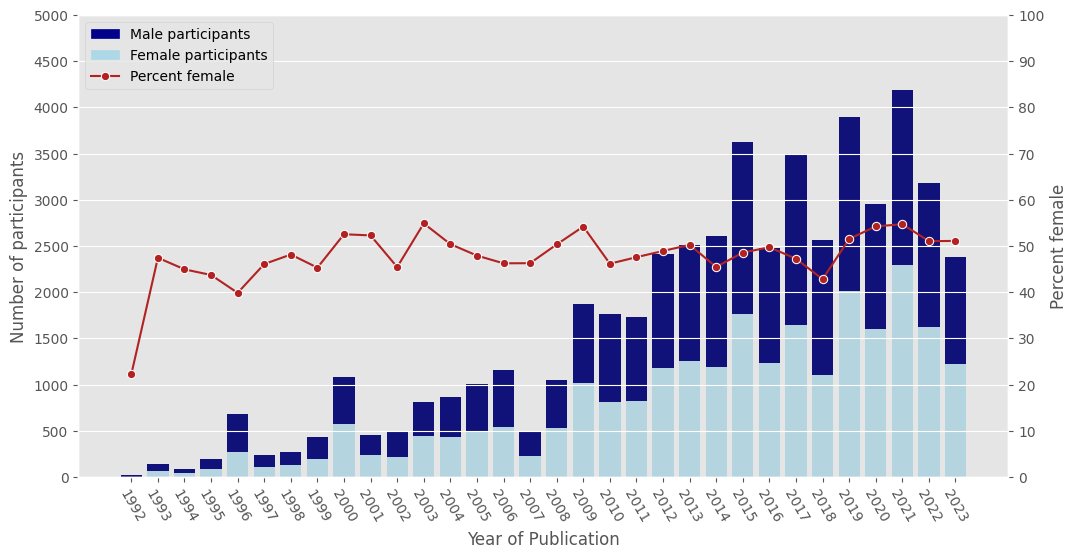
filtage = filtered[['Geographical location','Average Age (Years)']].copy().dropna()
filtage['Average Age (Years)'] = pd.to_numeric(filtage['Average Age (Years)'], errors='coerce').dropna()
filtage = filtage.dropna()

colors = plotly.colors.PLOTLY_SCALES["Viridis"]

fig = go.Figure()

for i in range(0,3):
    fig.add_trace(go.Violin(y=filtage['Geographical location'][(filtage['Geographical location'] == pd.unique(filtage['Geographical location'])[i])],
                            x=filtage['Average Age (Years)'][(filtage['Geographical location'] == pd.unique(filtage['Geographical location'])[i])],
                            side='positive',
                            pointpos=-.3,
                            line_color='black',
                            orientation='h',
                            fillcolor=colors[i*4+4][1],
                            marker=dict(size=3),
                            spanmode='hard',
                            box=dict(width=.5),
                            showlegend=False,
                            width=.9)
             )

fig.update_traces(box_visible=True,
                  points='all',
                  jitter=0.1,
                  scalemode='count')
fig.update_layout(
    height=500,
    width=750,
    xaxis=dict(title='Average age (years)'),
    plot_bgcolor='rgba(0.2, 0.2, 0.2, 0.2)',
    violingap=0, violingroupgap=0, violinmode='overlay')
fig.show()
Loading...
df_paths2 = df_paths.loc[df_paths['Average age'].notna()]

colors = plotly.colors.PLOTLY_SCALES["Viridis"]

fig = go.Figure()

for i in range(0,len(pd.unique(df_paths2['Pathology']))):
    fig.add_trace(go.Violin(y=df_paths2['Pathology'][(df_paths2['Pathology'] == pd.unique(df_paths2['Pathology'])[i])],
                            x=df_paths2['Average age'][(df_paths2['Pathology'] == pd.unique(df_paths2['Pathology'])[i])],
                            side='positive',
                            pointpos=-.3,
                            line_color='black',
                            orientation='h',
                            fillcolor=colors[i][1],
                            marker=dict(size=3),
                            spanmode='hard',
                            box=dict(width=.5),
                            showlegend=False)
             )

fig.update_traces(box_visible=True,
                  points='all',
                  jitter=0.1,
                  scalemode='count')
fig.update_layout(
    height=1000, width=1000,
    xaxis=dict(title='Average age (years)'),
    plot_bgcolor='rgba(0.2, 0.2, 0.2, 0.2)',
    violingap=0, violingroupgap=0, violinmode='overlay')
fig.show()
Loading...
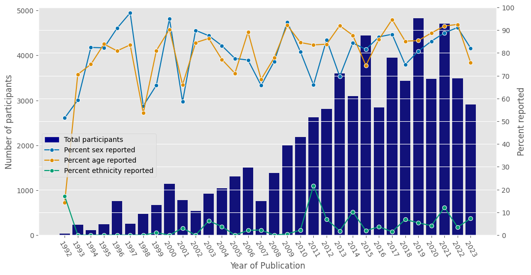
df_full['Unreported sex'] = df_full.loc[:,'Total participants'] - df_full.loc[:,['Male','Female']].sum(axis=1)
df_full['Reported sex'] = df_full.loc[:,['Male','Female']].sum(axis=1)

df_full.loc[df_full['Average age'].notna(),'Unreported age'] = 0
df_full.loc[df_full['Average age'].isna(),'Unreported age'] = df_full.loc[df_full['Average age'].isna(),'Total participants']
df_full.loc[df_full['Average age'].notna(),'Reported age'] = df_full.loc[df_full['Average age'].notna(),'Total participants']
df_full.loc[df_full['Average age'].isna(),'Reported age'] = 0

df_full.loc[df_full['Ethnicity']!='Ethnic distribution not specified','Unreported ethnicity'] = 0
df_full.loc[df_full['Ethnicity']!='Ethnic distribution not specified','Reported ethnicity'] = df_full.loc[df_full['Ethnicity']!='Ethnic distribution not specified','Total participants']
df_full.loc[df_full['Ethnicity']=='Ethnic distribution not specified','Unreported ethnicity'] = df_full.loc[df_full['Ethnicity']=='Ethnic distribution not specified','Total participants']
df_full.loc[df_full['Ethnicity']=='Ethnic distribution not specified','Reported ethnicity'] = 0


df_grouped = df_full[['Year of Publication','Unreported sex','Reported sex','Unreported age','Reported age','Unreported ethnicity','Reported ethnicity','Total participants']].copy().fillna(0)
dfrep = df_grouped.groupby('Year of Publication').sum()
dfrep = dfrep.loc[dfrep.index[0:32]]
s1 = dfrep['Total participants']
s2 = dfrep['Reported sex'] / dfrep['Total participants'] * 100
s3 = dfrep['Reported age'] / dfrep['Total participants'] * 100
s4 = dfrep['Reported ethnicity'] / dfrep['Total participants'] * 100

plt.style.use('ggplot')
ax1 = sns.set_style(style=None, rc=None)
fig, ax1 = plt.subplots(figsize=(12,6))


sns.set_palette("colorblind")

b1 = sns.barplot(x='Year of Publication', y='Total participants', data=dfrep, color='darkblue', ax=ax1)
top = mpatches.Patch(color='darkblue', label='Total participants')
plt.xticks(rotation=-60)
plt.ylabel("Number of participants")
ax1.grid(False)

dfrep['Percent sex reported'] = s2
dfrep['Percent age reported'] = s3
dfrep['Percent ethnicity reported'] = s4

ax2 = plt.twinx()
rl = sns.lineplot(x=np.arange(32), y='Percent sex reported', ax=ax2, marker='o', data=dfrep,  label='Percent sex reported',legend=False)
r2 = sns.lineplot(x=np.arange(32), y='Percent age reported', ax=ax2, marker='o', data=dfrep,  label='Percent age reported',legend=False)
r3 = sns.lineplot(x=np.arange(32), y='Percent ethnicity reported', ax=ax2, marker='o', data=dfrep, label='Percent ethnicity reported',legend=False)

ax2.set_ylabel('Percent reported')
ax2.set_ylim(0,100)
ax2.set_yticks([0,10,20,30,40,50,60,70,80,90,100])
ax2.grid(True)

handle, label = ax2.get_legend_handles_labels()
plt.legend(handles=[top,handle[0],handle[1],handle[2]],loc='center left',bbox_to_anchor=(0,.35))
plt.show()